BERUHÁZÁSI TANÁCSADÁS - CASE STUDY
ALMÁSI - Minimalist B2B Platform & Responsive System
A Swiss-influenced B2B web system built to simplify complex architectural risk for real estate investors, establish immediate authority, and deliver an intuitive experience across desktop and mobile.
Visit Live Site ↗ Visit Live Site ↗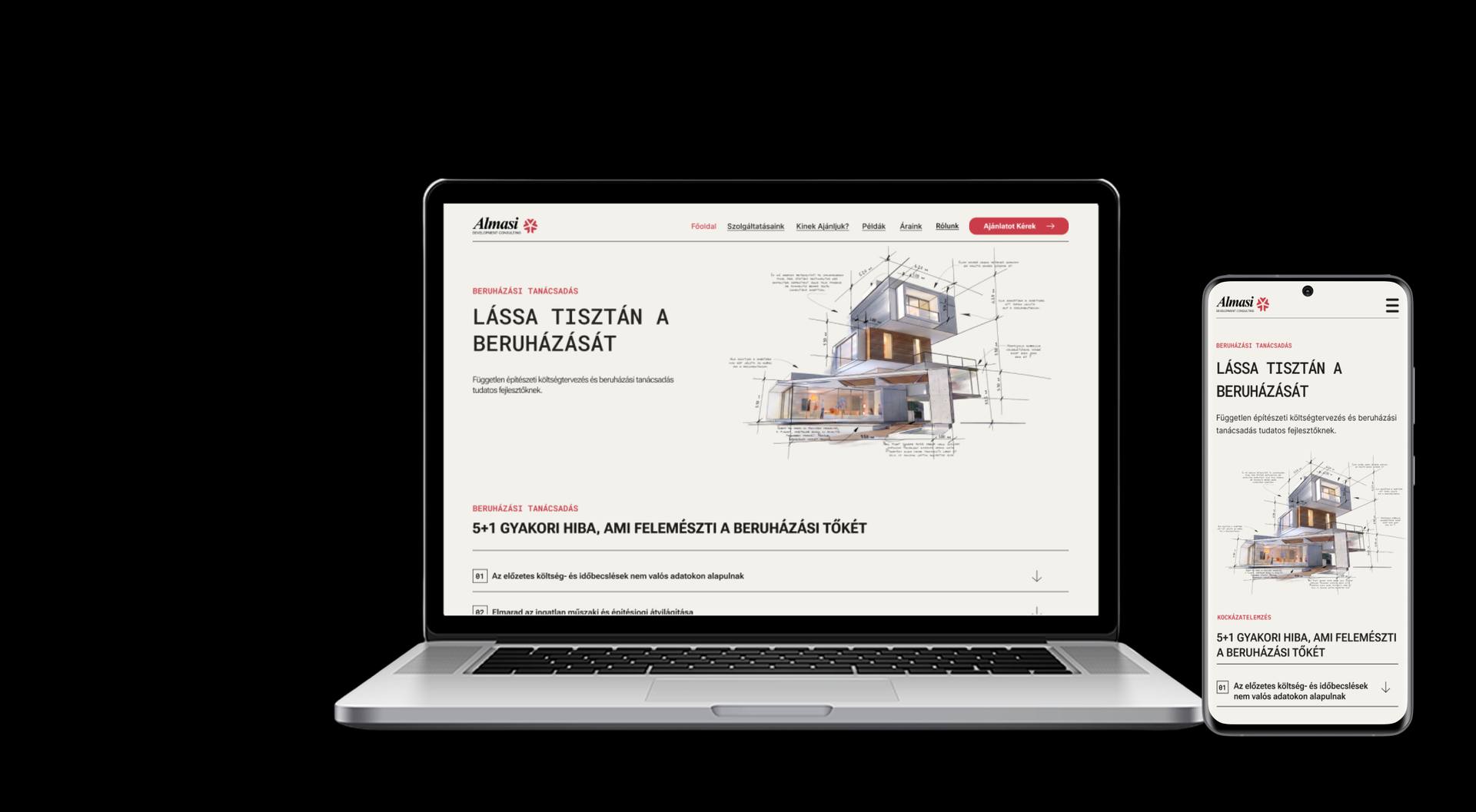
01 - The Challenge
Designing trust into complexity
Real estate and architectural risk is inherently complex. The interface needed to communicate dense, high-stakes information without overwhelming a first-time investor - while keeping the path to conversion always in reach.
Information density
Complexity without overload
A modular accordion system communicates the "5+1" critical project risks without causing cognitive overload on first read.
Visual alignment
Architectural precision
The visual identity needed to mirror architectural rigor - sharp geometry, technical grids, structural drawing conventions.
Conversion
High-intent B2B path
The primary CTA ("Ajánlatot Kérek") had to stay consistently accessible across every screen size.
02 - Direction
Finding the right visual language
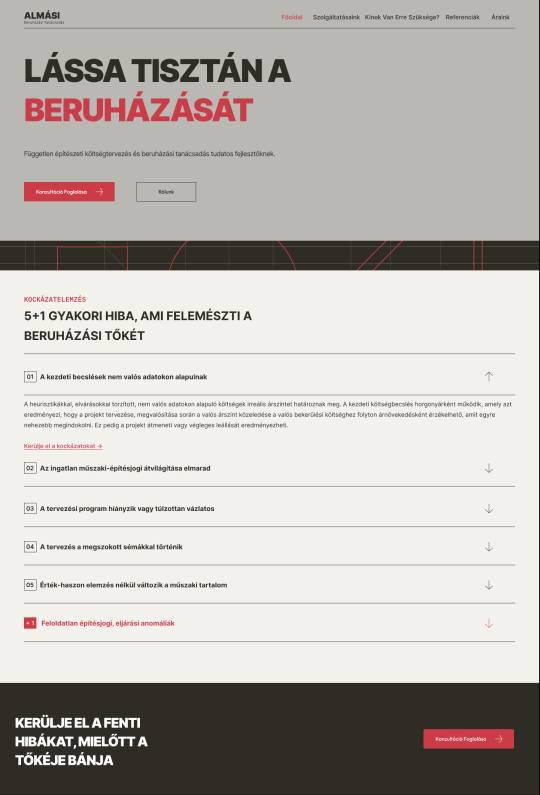
Before settling on the final direction, I explored a darker, higher-contrast concept - bold headline type, heavier weights, more technical in feel. It communicated precision, but it read closer to an engineering or SaaS product than a trusted B2B investment advisor.
The warmer, Swiss-influenced system that followed traded some of that visual intensity for restraint and legibility - closer to architectural drafting paper than a dashboard - which better matched how a first-time investor needed to feel: informed, not overwhelmed.
03 - Design System
ALMÁSI's brand system
Built on a Swiss International Typographic grid for the client's own brand - shown here as reference, distinct from this portfolio's own visual language.
| Desktop container | 1200-1280px on 1440px canvas |
|---|---|
| 2-column gap | 24px |
| Mobile canvas | 375px, 16px side margins |
| Mobile canvas | Fluid collapse to single column |
| Primary - Roboto Flex | Headings & body |
|---|---|
| H1 hero | Uppercase, medium, 120% line-height |
| Body copy | Regular, 150% line-height |
| Secondary - Roboto Mono | Labels & numbering |
#F3F1EC#E3E2DC#AE232E#464543
04 - Key Decisions
Four decisions that shaped the platform
01
3D architectural blueprint in the hero
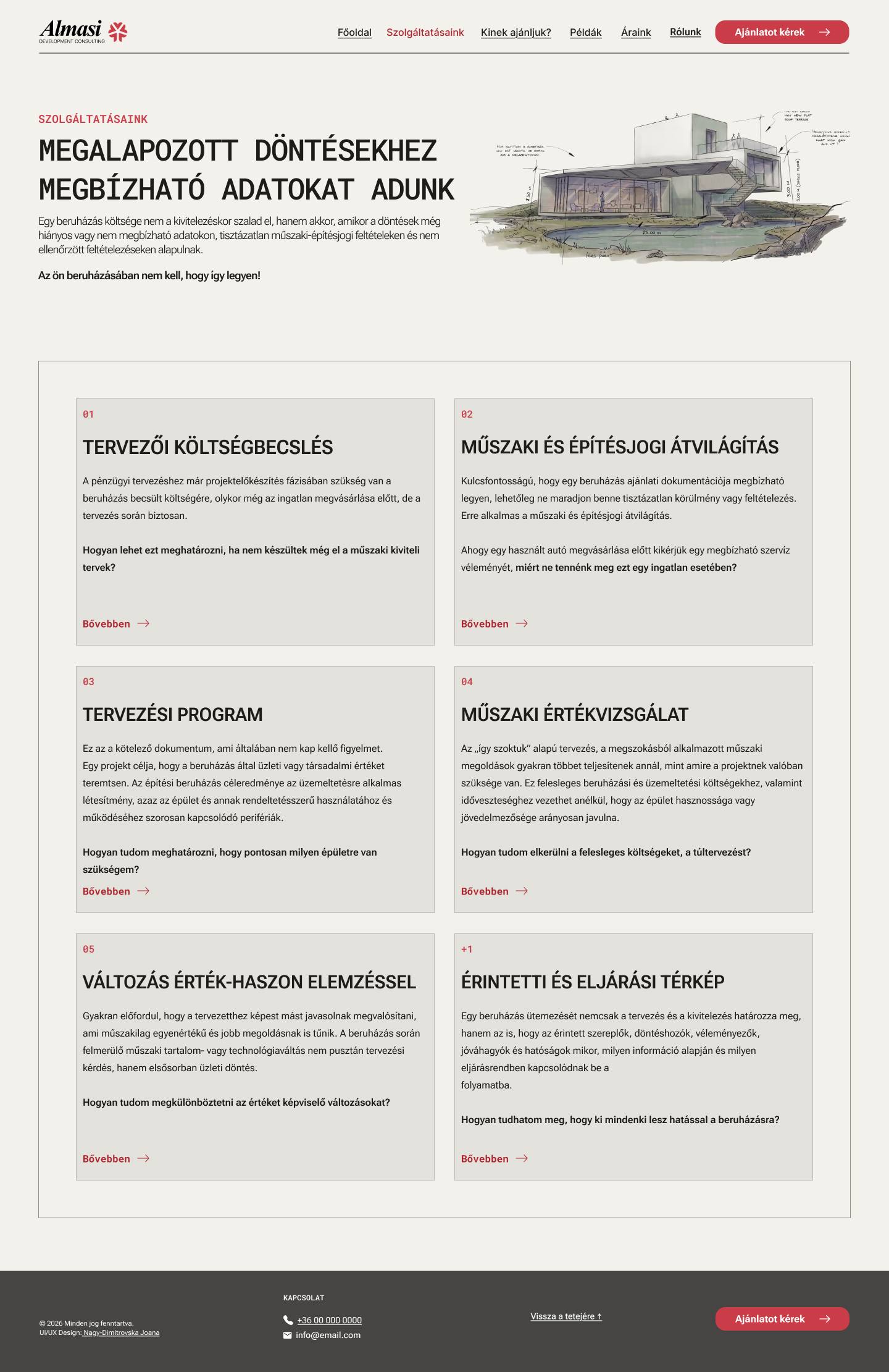
Instead of stock imagery, the hero integrates a 3D architectural blueprint with structural measurement grids -signaling analytical rigor from the first screen.
02
"5+1" risk assessment accordion
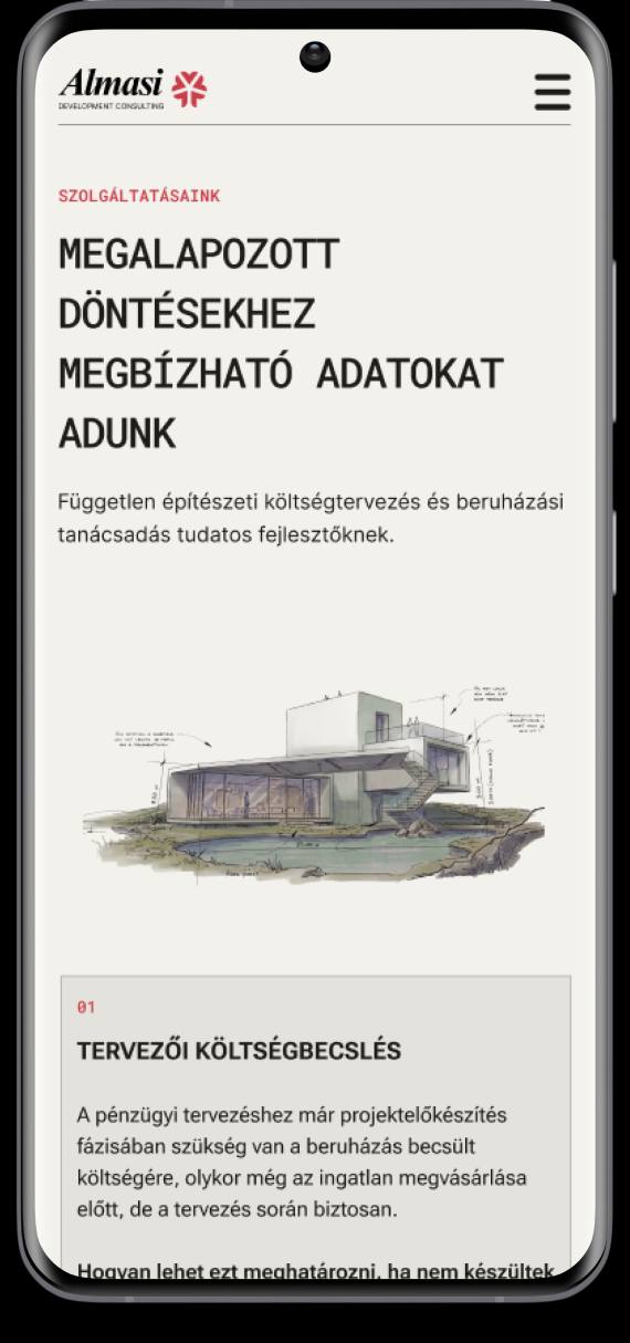
Risk items collapse by default so visitors can scan headings before committing to detail. The "+1" item carries a muted red accent to flag it as the critical anomaly.
03
Single-row B2B footer
Desktop footer streamlines into one horizontal row: copyright → contact → back to top → request a quote - placing the CTA at the natural end of the journey.
04
Mobile hamburger drawer
A full-screen overlay menu with touch targets at minimum 44×44px, built for effortless single-thumb navigation.
05 - Final Screens
The delivered platform
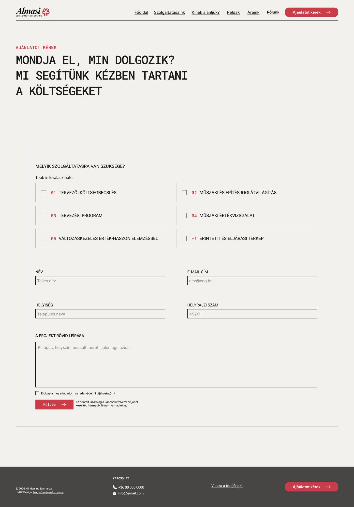
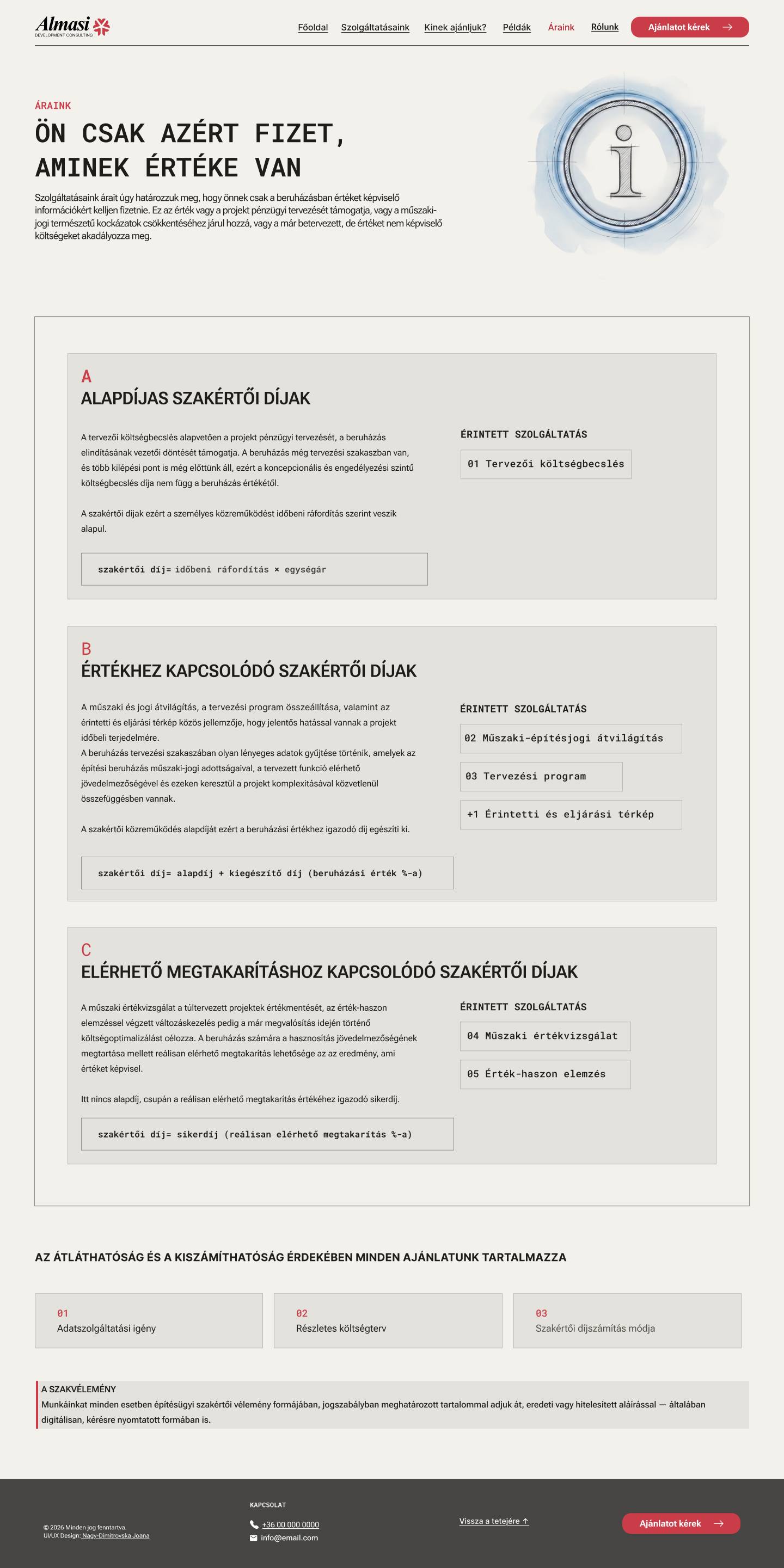
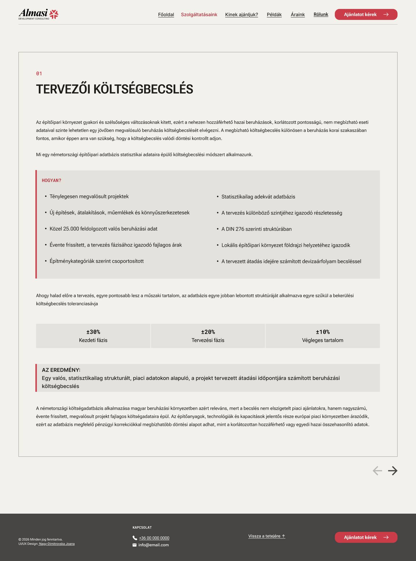
A from-scratch build - final desktop screens from the delivered Figma system, ready for front-end handoff.
06 - Responsive Breakdown
Desktop to mobile
| ELEMENT | DESKTOP (1440PX) | MOBILE (393PX) |
|---|---|---|
| Grid layout | 2-column grid, 24px gap | 1-column vertical stack |
| H1 hero title | 48px, uppercase | 28-30px, uppercase |
| Service cards | ~588px width | 100% fill, ~343px |
| Footer layout | Single-row horizontal | Vertical stack, left-aligned |
| Primary CTA | Fixed width, right-aligned | Full-width, 50px height |
07 - OUTCOME
Result
Production-ready handoff
A fully structured Figma design system with clean Auto Layouts, precise spacing, and semantic typography styles - ready for front-end development.
Established brand authority
Delivered an authoritative, Swiss Minimalist digital identity suited to high-stakes B2B architectural consulting.