Product Design · Case Study
WaitLess MD
To fix clinic overcrowding and long wait times, I designed an accessible healthcare app that simplifies the patient journey. With AI symptom screening and digital check-ins, patients-including those with disabilities - can skip long lines and physical barriers.
Figma prototype View interactive prototype ↗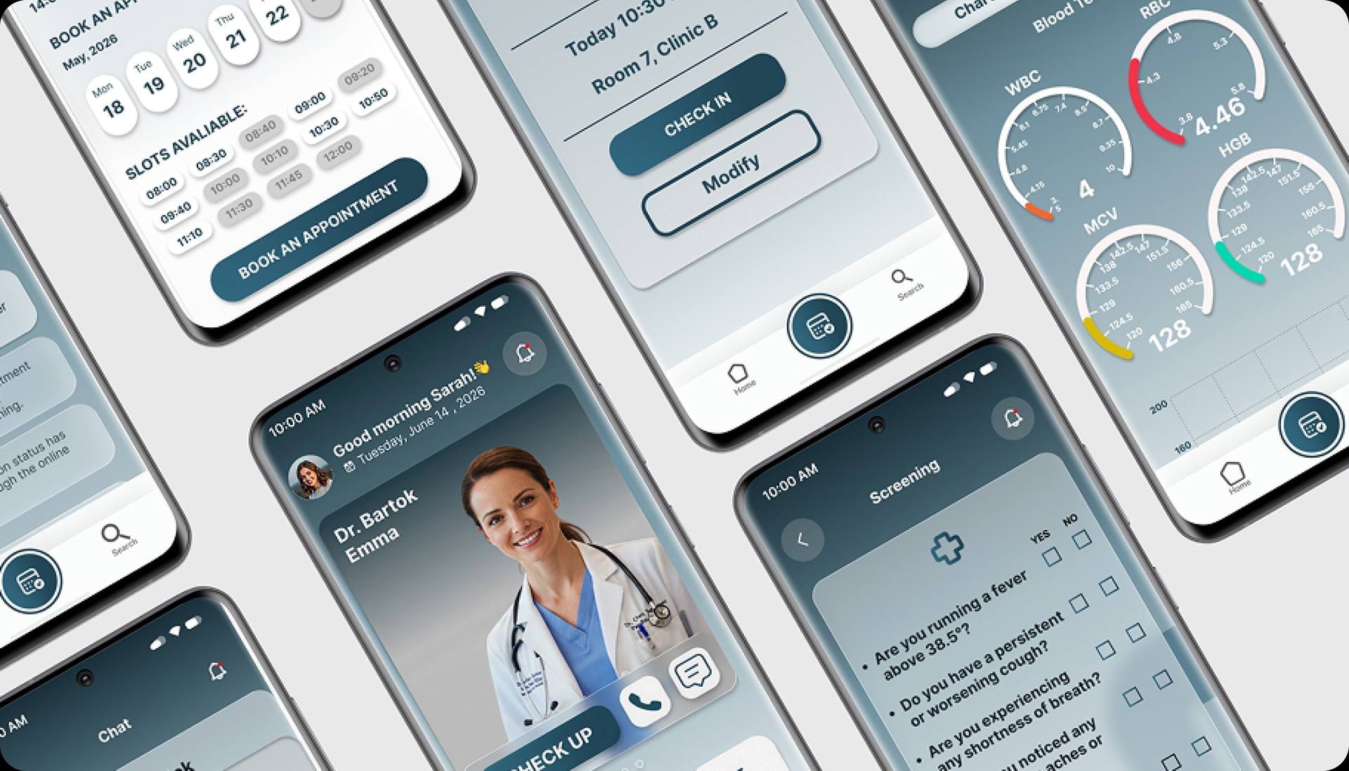
01 - Challenge & Process
Understanding the problem
The Problem: Daily healthcare tools are frustrating for medical staff to use and hard for patients to navigate-especially for people with disabilities.
Our Goal: Understand where these systems fail, uncover real user pain points, and build an intuitive tool that everyone can use effortlessly.
- Empathize
- Define
- Ideate
- Prototype
- Test
02 - Research
Understanding the problem
To gather diverse perspectives, I distributed a quantitative survey and conducted interviews with 30 participants, spanning Central/Eastern Europe (Hungary, Slovenia, Croatia, North Macedonia), Egypt, and the USA. The study included participants aged 18-60 with varying health profiles - individuals with disabilities, those managing chronic illnesses, and those with no underlying conditions.
Key insight: Despite the geographic and demographic diversity, nearly 90% of participants shared identical or highly similar frustrations regarding their experience with the healthcare system.
Research Findings
User research pain points
Waiting in line
Users value their time, and ambiguity increases anxiety. Future design should prioritize solutions that save time and simplify the overall process.
Difficulty booking an appointment
Many users face multiple issues booking an appointment. This guides the design toward easy and fast booking options.
Difficulty reaching the doctor by phone
Poor communication erodes user trust. The design approach focuses on better accessibility, updates, and a call/chat option.
Challenging for disabled people
Users with disabilities face significant obstacles getting to a doctor. The concept introduces a check-in and check-up process that simplifies this.
Crowded waiting rooms
Crowding elevates stress for medical staff too. The concept solves most health issues online to decrease crowding.
Poor duration of consultation
Many users feel rushed and frustrated during check-up. Design helps doctors prioritize patients who genuinely need one.
03 - Define
Personas
Three personas emerged from the research, representing a patient balancing work and family, a patient navigating a physical disability, and a nurse managing the other side of the same system.

Kovács Anna
A full-time working mother who needs a faster, simpler way to reach the family doctor in order to save more time for her daughter.
Goals
- An easy way for doctors and patients to connect
- Simple appointment booking
- Shorter waiting time at the clinic
Frustrations
- Problems calling the office by phone
- Problems booking an appointment
- Waiting in line, feeling rushed and ignored
"As a full-time working mom, I want to avoid the hassle of seeing the family doctor and reduce wait times so I can spend more time with my family."

Omar Burr
A man with a physical disability who relies on his father for transportation to 3-5 annual doctor visits and needs to solve his challenges independently.
Goals
- Improved communication with staff
- A simplified appointment method
- Better care and attitude from staff
Frustrations
- Poor communication with staff
- Extended waiting-area time
- Obstacles getting from home to the office
"As an individual with a disability, I desire to resolve my challenges independently and without obstacles."
Kis-Waller Sarah
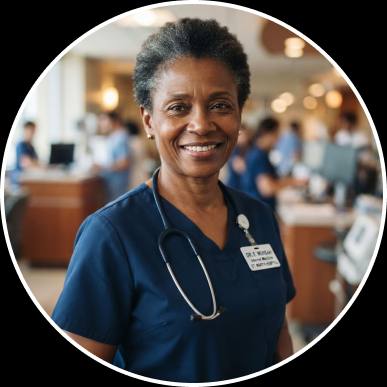
A nurse who needs a solution for crowded waiting rooms - one that keeps medical staff less stressed and more focused on patients.
Goals
- Avoiding the crowds
- Faster appointment scheduling
- An easy way for patients and doctors to talk
Frustrations
- Lack of comprehension between staff and patient
- High office density raising stress
- Disorganized appointment process
"As a healthcare worker, I need a solution for the long patient wait times so patients are happier and staff can focus more on each person's care."
User Journey
Mapping the patient path
The main focus was finding a time-saving solution across five stages: making an appointment, finding a way there, arriving at the office, the consultation, and the way back.
| Persona | Make an appointment | Find a way & how to go | At the office | Consultation | On the way back |
|---|---|---|---|---|---|
| Kovács Anna | Upset, frustrated calling and identifying herself | Upset - adapting her day, finding childcare | Confused, frustrated waiting in line | Barely satisfied, confused | Relieved, glad, alert |
| Omar Burr | Upset, frustrated getting connected | Upset, sad, demotivated - relies on his father | Confused, frustrated in line | Barely satisfied, confused | Relieved, glad, alert |
| Kis-W. Sarah | Upset, frustrated managing calls | / | Confused, frustrated managing the room | Barely satisfied, confused | / |
Kovács Anna
- Make an appointment
- Upset, frustrated calling and identifying herself
- Find a way & how to go
- Upset - adapting her day, finding childcare
- At the office
- Confused, frustrated waiting in line
- Consultation
- Barely satisfied, confused
- On the way back
- Relieved, glad, alert
Omar Burr
- Make an appointment
- Upset, frustrated getting connected
- Find a way & how to go
- Upset, sad, demotivated - relies on his father
- At the office
- Confused, frustrated in line
- Consultation
- Barely satisfied, confused
- On the way back
- Relieved, glad, alert
Kis-W. Sarah
- Make an appointment
- Upset, frustrated managing calls
- Find a way & how to go
- /
- At the office
- Confused, frustrated managing the room
- Consultation
- Barely satisfied, confused
- On the way back
- /
The main focus was finding a time-saving solution across five stages: making an appointment, finding a way there, arriving at the office, the consultation, and the way back.
04 - Ideate & Prototype
From paper to digital
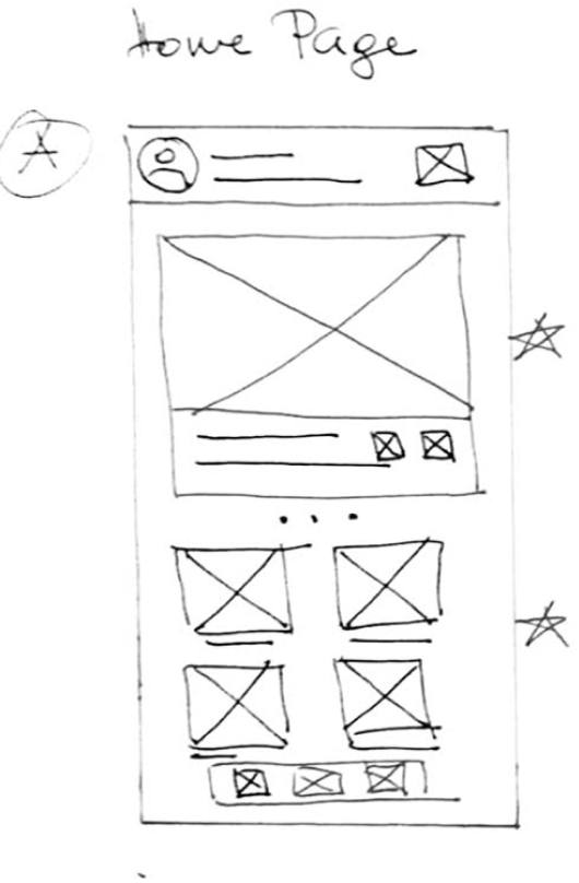
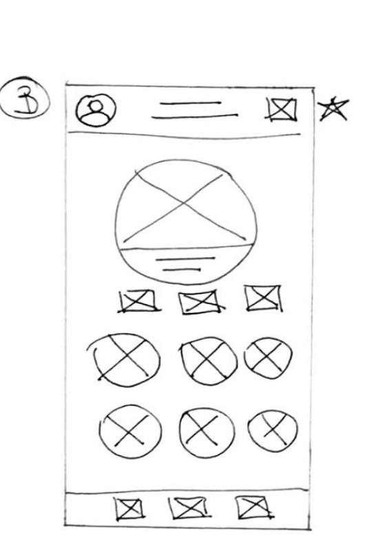
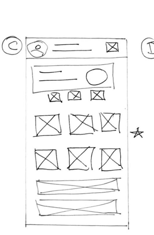
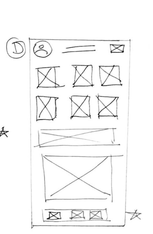
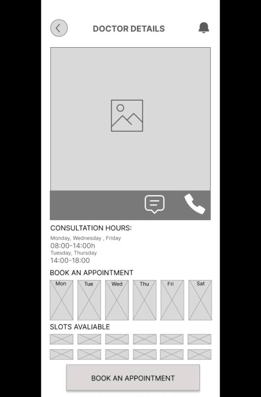
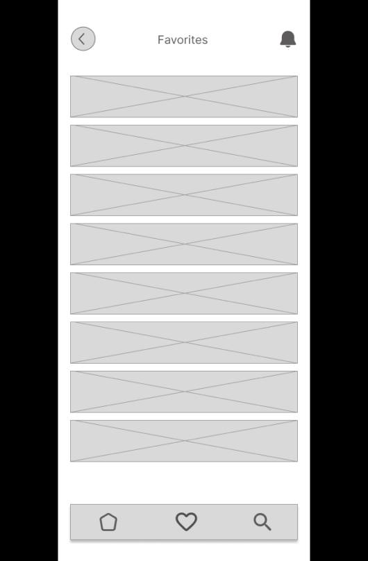
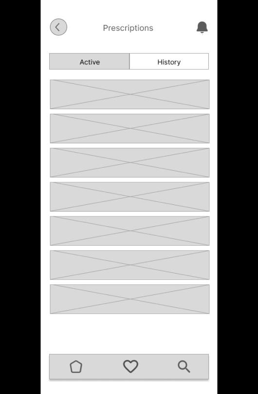
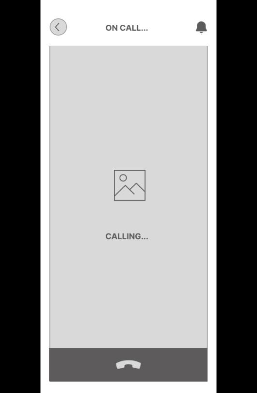
Paper wireframes The main focus was the user's pain points, which helped prioritize features - online check-up screening, booking appointments, and getting in touch with the doctor. Early sketches explored several home page directions before settling on a card-based layout.
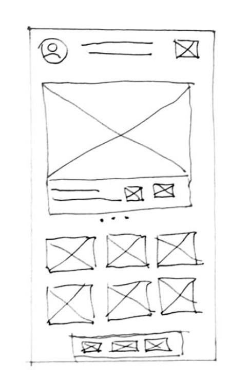
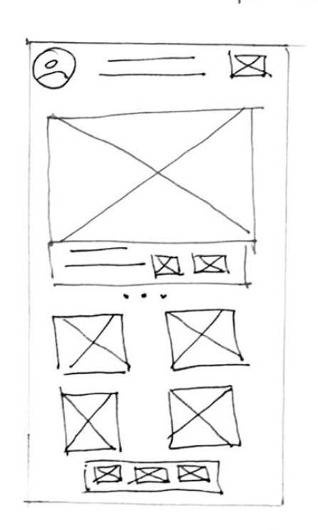
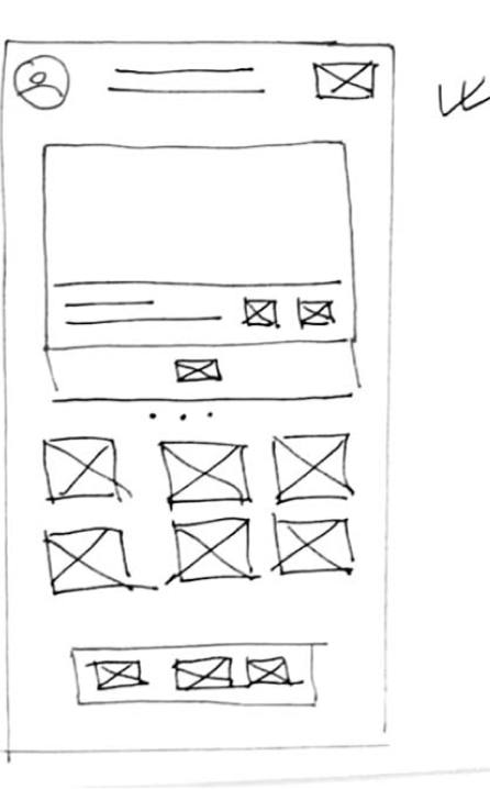
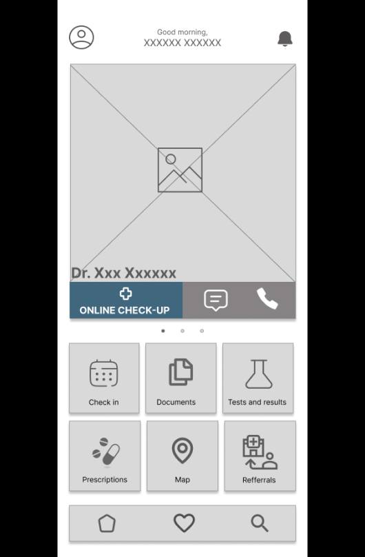
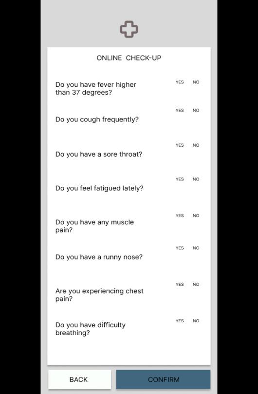
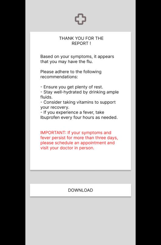
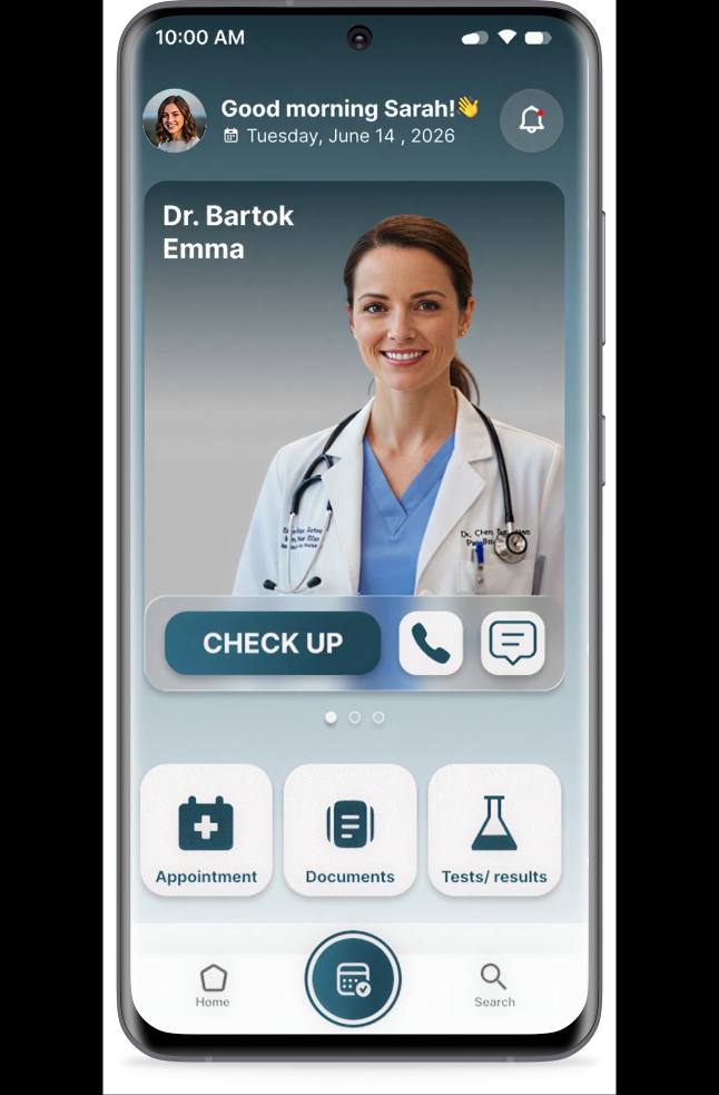
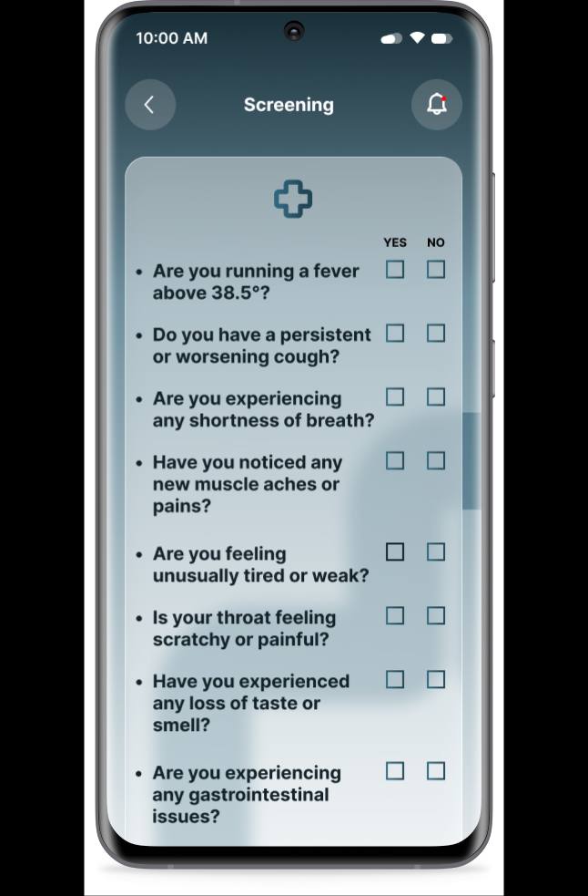
Digital wireframes Converting paper sketches into digital wireframes helped visualize pages, buttons, and ideas more precisely. The home screen centers the doctor's profile with a call/chat option, a highlighted "Online Check-Up" button, and a feature menu (documents, prescriptions, referrals, tests, map). The online check-up flow uses a simple yes/no symptom questionnaire.
05 - Test
Usability study findings
To evaluate the design, I conducted a remote, unmoderated usability study on a low-fidelity prototype with 5 participants (3 male, 2 female), aged 25-50 - all active healthcare consumers visiting their family doctor 1-10 times annually.
Round 1 findings
- Unable to cancel the check-up
- Inconsistency of icons
- Found it difficult to check in
Round 1 findings
- Unable to cancel the check-up
- Inconsistency of icons
- Found it difficult to check in
06 - Accessibility
Designing for every patient
Two of three personas centered a disability or a communication barrier, so accessibility wasn't a final pass - it shaped core decisions throughout.
Touch targets
Interactive elements sized to at least 44×44px, so tapping accurately doesn't require fine motor precision.
High contrast
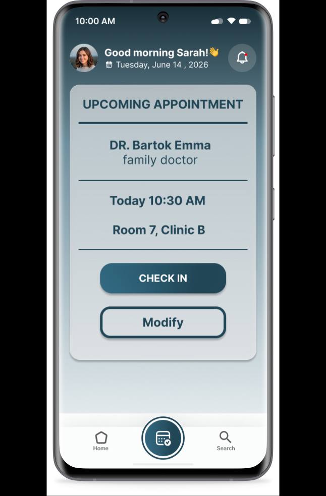
Text and key actions (Check In, Confirm) use strong contrast against the app's darker gradient backgrounds for legibility.
Plain language
Screening questions use short, direct phrasing ("Are you running a fever?") rather than clinical terminology.
Reduced dead ends
Every flow - including screening - keeps a visible way back, so a wrong tap never traps someone mid-task.
Account recovery
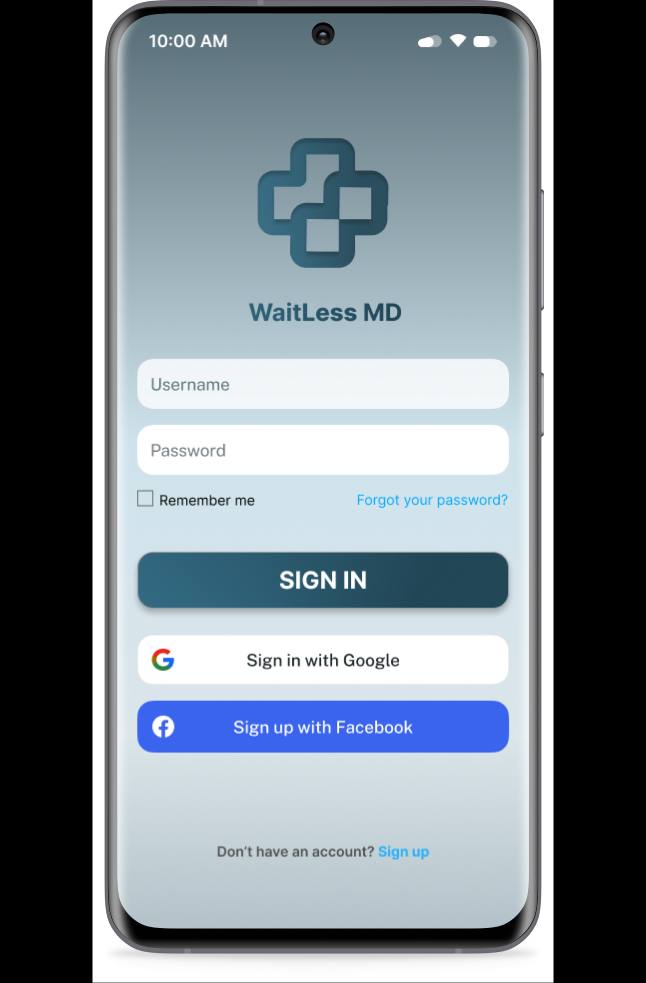
A visible "Forgot your password?" link removes a barrier that disproportionately affects less tech-confident users.
Consistent iconography
One standardized icon set across every screen, so recognition doesn't reset each time a user moves to a new section.
07 - Final Screens
The delivered app
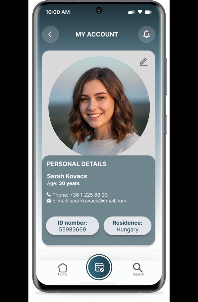
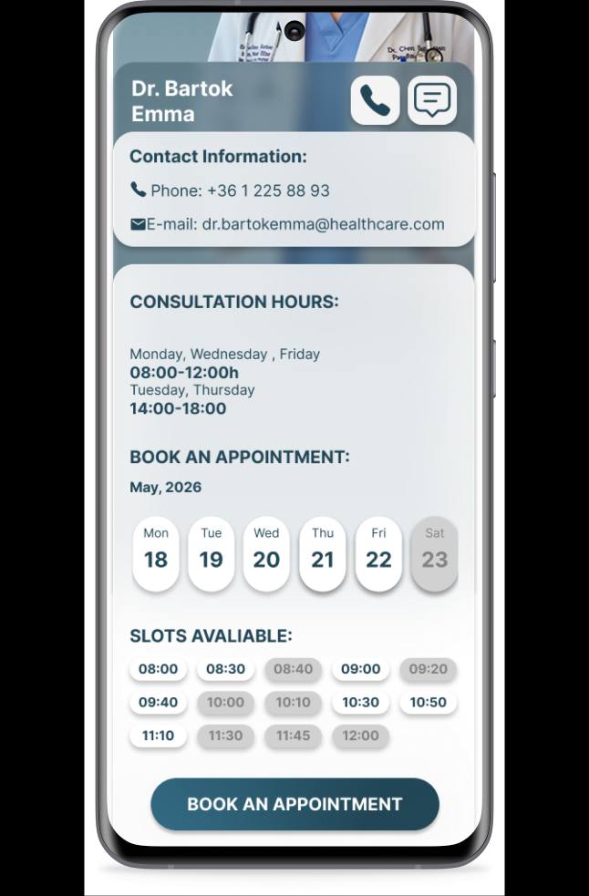
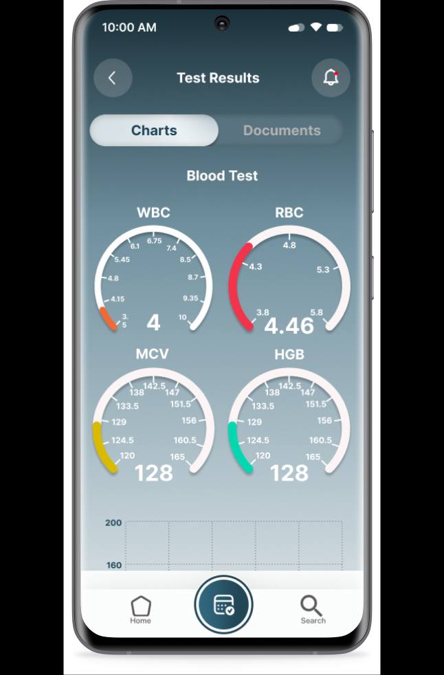
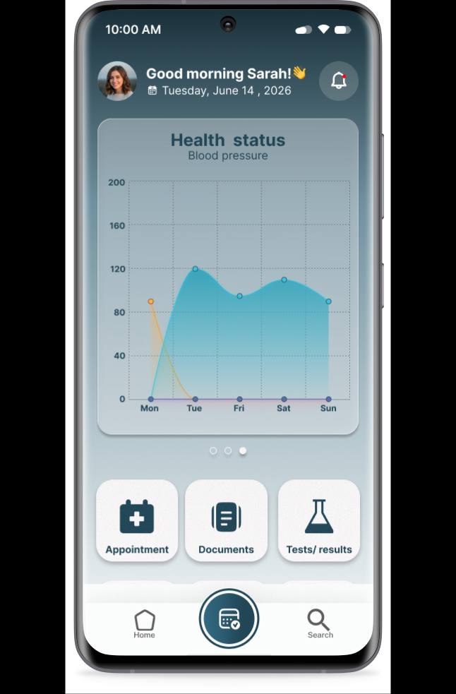
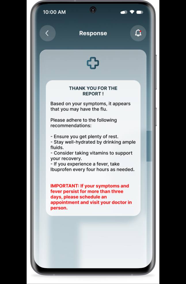
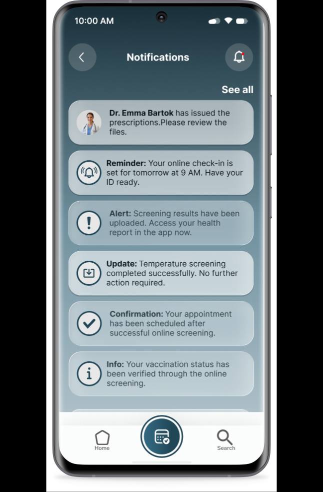
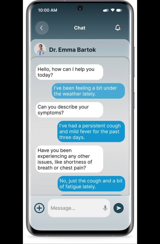
Key screens from the finished prototype, reflecting the Round 1 fixes above.
08 - Design System
WaitLess MD's visual system
The product's own interface system - shown here as reference, distinct from this portfolio's own visual language.
NOTE: The palette and type below belong to WaitLess MD's product, not this portfolio - shown as a reference to the system delivered.
| Typeface | Inter - headings & body |
|---|---|
| Screen title | 18-20px, weight 600 |
| Body / list items | 14-15px, weight 400-500 |
| Buttons | 15-16px, weight 600, uppercase |
| Grid | Mobile-first, single column |
|---|---|
| Touch targets | Minimum 44x44px |
| Navigation | Fixed bottom tab bar, 3 items |
| Cards | Rounded, 2x3 icon grid on home |
#2A424E#285568#92AAB4#FFFFFF
Conclusion
Approach & key takeaways
Almost a month of user research and empathetic design was an incredibly rewarding experience. Uncovering core user pain points allowed a seamless transition from research to ideation - balancing user needs with a visually engaging, functional interface. The wireframing and usability testing phases were the steepest learning curves, and the process led to a sustainable, time-saving concept that genuinely helps people navigate their healthcare challenges.
Empathy-driven research Speaking with both patients and medical workers revealed a surprising truth: despite being on opposite sides of the healthcare system, they shared almost identical frustrations regarding administrative bottlenecks.
Accessibility first In healthcare, inclusive design isn't optional. High-contrast readability, a clear visual hierarchy, and simple language keep the app stress-free for everyone.
AI-driven efficiency The online screening feature lets patients report symptoms seamlessly. Using AI assistance, doctors can quickly review each case and determine whether an in-office visit is needed - directly reducing overcrowding in clinic waiting rooms.
Iterative testing Wireframing and testing taught me that the simplest solution is usually the hardest to design - but easily the most rewarding to build.